p <- 0.45
N <- 1000
x <- sample(c(0, 1), size = N, replace = TRUE, prob = c(1 - p, p))
x_hat <- mean(x) QQ plot
How a Q–Q plot is constructed
A Q–Q plot compares:
- sample quantiles from your data
- theoretical quantiles from some reference distribution, often a normal distribution
The idea is: if the data really come from that reference distribution, the points should lie roughly on a straight line.
Suppose your data are
\[ x_1, x_2, \dots, x_n. \]
Step 1: sort the data
Order them from smallest to largest:
\[ x_{(1)} \le x_{(2)} \le \cdots \le x_{(n)}. \]
These are the sample quantiles.
Step 2: choose plotting probabilities
For each rank (i), assign a probability, often approximately
\[ p_i = \frac{i - a}{n+1-2a}, \qquad i=1,\dots,n. \] where the default offset is \[a=\begin{cases} 3/8, & n\ge 10 \\ 1/2, & n >10 \end{cases} \] These probabilities mark where each ordered observation sits in the distribution. If \(n >10\), \(a=1/2\) and \(p_i \approx \frac{i-1/2}{n}\).
Step 3: compute theoretical quantiles
If the reference distribution is (N(,^2)), compute
\[ q_i = F^{-1}(p_i), \]
where (F^{-1}) is the quantile function of that normal distribution.
So (q_i) is the theoretical value such that
\[ P(X \le q_i) = p_i. \]
For a normal Q–Q plot, these are the normal quantiles.
Step 4: plot the pairs
Plot the points
\[ (q_i,; x_{(i)}). \]
So:
- x-axis = theoretical quantiles
- y-axis = sample quantiles
If the sample distribution matches the theoretical one well, then
\[ x_{(i)} \approx q_i \]
up to location and scale, so the points fall near a straight line.
Why the line \(y=x\) appears
If the theoretical distribution and the sample have exactly the same center and spread, then the points should lie near
\[ y=x. \]
But there is an important subtlety:
- if you compare your data to the standard normal \(N(0,1)\), the ideal line is only \(y=x\) when your data also have mean 0 and sd 1
- if you compare to a normal with the same mean and sd as your data, then \(y=x\) is more sensible
Even then, stat_qq_line() is usually better because it computes a fitted reference line based on quartiles.
B <- 10000
x_hat <- replicate(B, {
  x <- sample(c(0, 1), size = N, replace = TRUE, prob = c(1 - p, p))
  mean(x)
}) library(tidyverse)── Attaching core tidyverse packages ──────────────────────── tidyverse 2.0.0 ──
✔ dplyr 1.1.4 ✔ readr 2.1.6
✔ forcats 1.0.1 ✔ stringr 1.6.0
✔ ggplot2 4.0.2 ✔ tibble 3.3.1
✔ lubridate 1.9.4 ✔ tidyr 1.3.2
✔ purrr 1.2.1
── Conflicts ────────────────────────────────────────── tidyverse_conflicts() ──
✖ dplyr::filter() masks stats::filter()
✖ dplyr::lag() masks stats::lag()
ℹ Use the conflicted package (<http://conflicted.r-lib.org/>) to force all conflicts to become errorsdata.frame(x_hat = x_hat) |> ggplot(aes(sample = x_hat)) +
stat_qq(dparams = list(mean = mean(x_hat), sd = sd(x_hat))) +
geom_abline()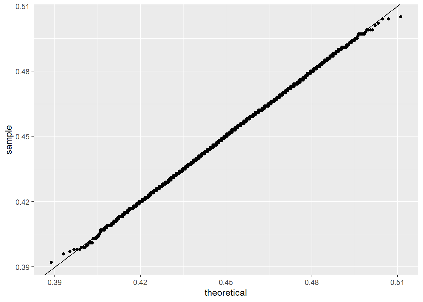
this works as follows:
stat_qq(...)sorts the values ofx_hat- it computes theoretical quantiles from a normal distribution with mean
mean(x_hat)and sdsd(x_hat) - it plots sample quantiles against theoretical quantiles
geom_abline()adds the line (y=x)
So the plot checks whether the ordered values of x_hat look like quantiles from that normal distribution.
How to interpret the shape
If points are close to a straight line:
- the data are approximately from the reference distribution
If the plot bends upward or downward:
- the data may be skewed
If the ends depart strongly:
- the tails may be heavier or lighter than the reference distribution
For example:
- right tail too large: upper-right points rise above the line
- left tail too small: lower-left points fall below the line
- S-shape: often suggests heavier tails than normal
Small concrete example
Suppose the sorted sample is
\[ x_{(1)}, x_{(2)}, x_{(3)}, x_{(4)}, x_{(5)}. \]
For (n=5), a common choice is
\[ p_i = \frac{i-0.5}{5} = 0.1, 0.3, 0.5, 0.7, 0.9. \]
If comparing to standard normal, the theoretical quantiles are about
\[ -1.28,\ -0.52,\ 0,\ 0.52,\ 1.28. \]
Then the Q–Q plot points are
\[ (-1.28, x_{(1)}),\ (-0.52, x_{(2)}),\ (0, x_{(3)}),\ (0.52, x_{(4)}),\ (1.28, x_{(5)}). \]
If the data are close to normal, these points line up.
Better reference line
Usually this is preferred:
ggplot(data.frame(x_hat = x_hat), aes(sample = x_hat)) +
  stat_qq(dparams = list(mean = mean(x_hat), sd = sd(x_hat))) +
  stat_qq_line(dparams = list(mean = mean(x_hat), sd = sd(x_hat)), color="red")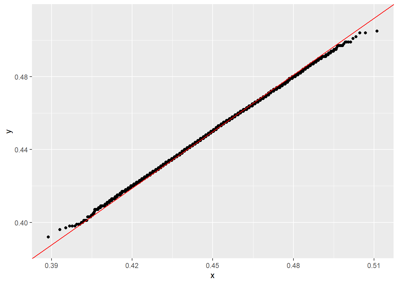
because stat_qq_line() gives a more meaningful Q–Q reference line than simply forcing \(y=x\).
qqnorm() and qqplot()
qqnorm() is for comparing one sample to a normal distribution. qqplot() is for comparing the quantiles of two datasets. Both rely on probability points internally, and qqnorm() specifically produces a normal QQ-plot.
1. Example: qqnorm()
Use this when you want to check whether data look approximately normal.
set.seed(1)
x <- rnorm(100)

qqnorm(x)
qqline(x, col = "red", lwd = 2)qqnorm(x)plots the sample quantiles ofxagainst the theoretical normal quantiles.qqline(x)adds a reference line. By default, that line is based on the first and third quartiles, not necessarily the identity line (y=x).
A second example with non-normal data:
set.seed(1)
y <- rexp(100)

qqnorm(y)
qqline(y, col = "red", lwd = 2)
This plot will usually bend away from the line because exponential data are not normal.
2. Example: qqplot()
Use this when you want to compare the distributions of two samples.
set.seed(1)
x <- rnorm(100, mean = 0, sd = 1)
y <- rnorm(100, mean = 1, sd = 1.5)

qqplot(x, y,
       xlab = "Quantiles of x",
       ylab = "Quantiles of y",
       main = "QQ-plot of y against x")
abline(0, 1, col = "red", lwd = 2)
qqplot(x, y)compares the quantiles ofxandy.- If the points fall near a straight line, the two distributions have similar shape.
- If the line is not close to slope 1 or intercept 0, one sample may be more spread out or shifted than the other.
3. qqplot() against a theoretical distribution
You can also use qqplot() to compare data to a non-normal theoretical distribution by supplying theoretical quantiles yourself.
For example, compare data to a chi-square distribution:
set.seed(1)
y <- rchisq(100, df = 3)

theoretical <- qchisq(ppoints(length(y)), df = 3)

qqplot(theoretical, sort(y),
       xlab = "Theoretical chi-square quantiles",
       ylab = "Sample quantiles",
       main = "Chi-square QQ-plot")
abline(0, 1, col = "red", lwd = 2)
This works because ppoints() generates the plotting probabilities used to evaluate inverse distribution functions such as qnorm() or qchisq().