murders |>ggplot() +geom_point(aes(x = population/10^6, y = total))
Add a layer
Since we defined p earlier, we can add a layer like this:
p +geom_point(aes(population/10^6, total))
Note x= and y = can be omitted
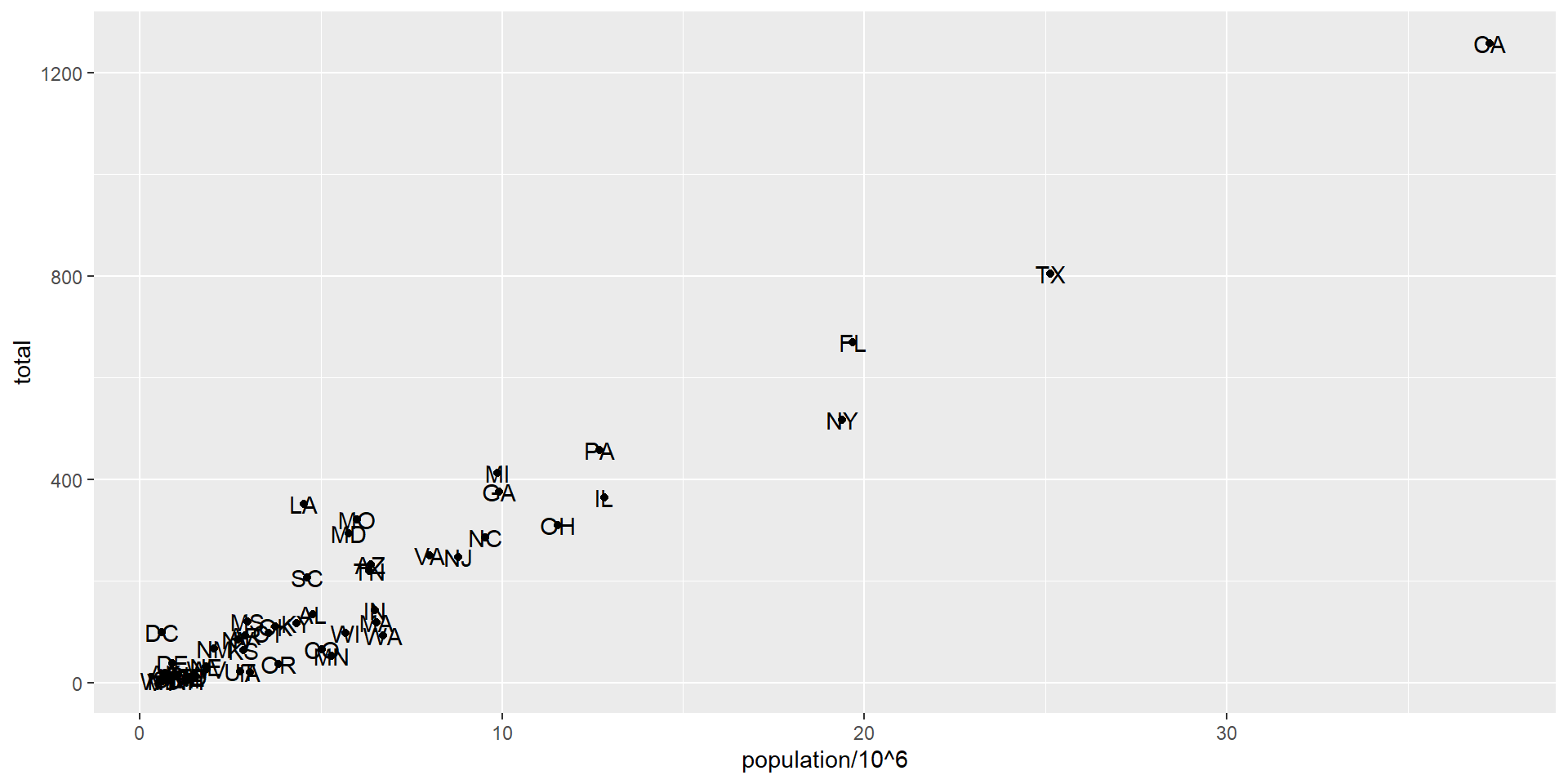
Add text with geom_text
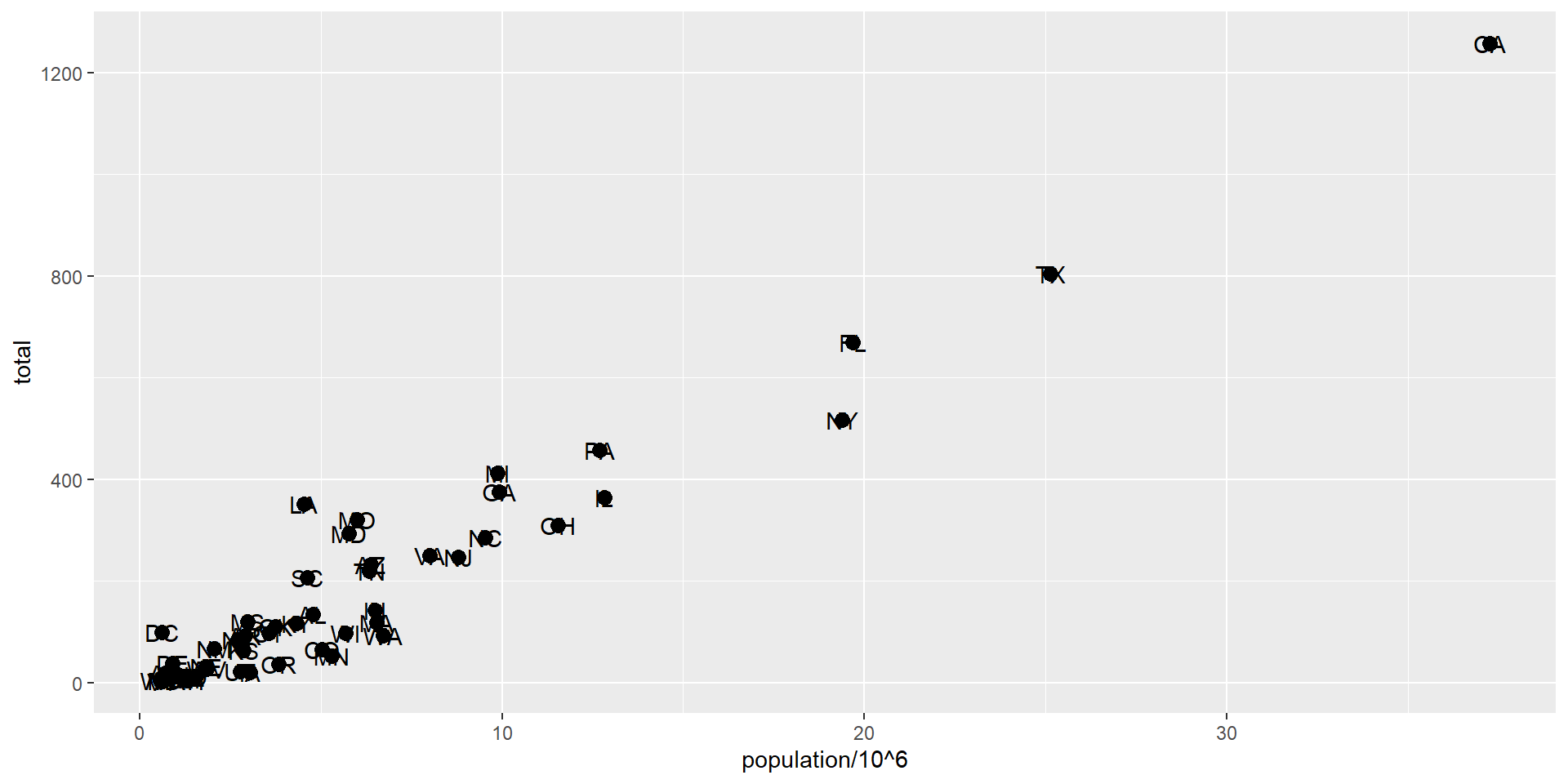
p +geom_point(aes(population/10^6, total)) +geom_text(aes(population/10^6, total, label = abb))
Scopes of aesthetical mapping
This one is fine
p_test <- p +geom_text(aes(population/10^6, total, label = abb))
is fine, whereas this call: this one is not
p_test <- p +geom_text(aes(population/10^6, total), label = abb)
will give you an error since abb is not found because it is outside of the aes function.
geom_text does not know where to find abb: it’s a column name and not a global variable.
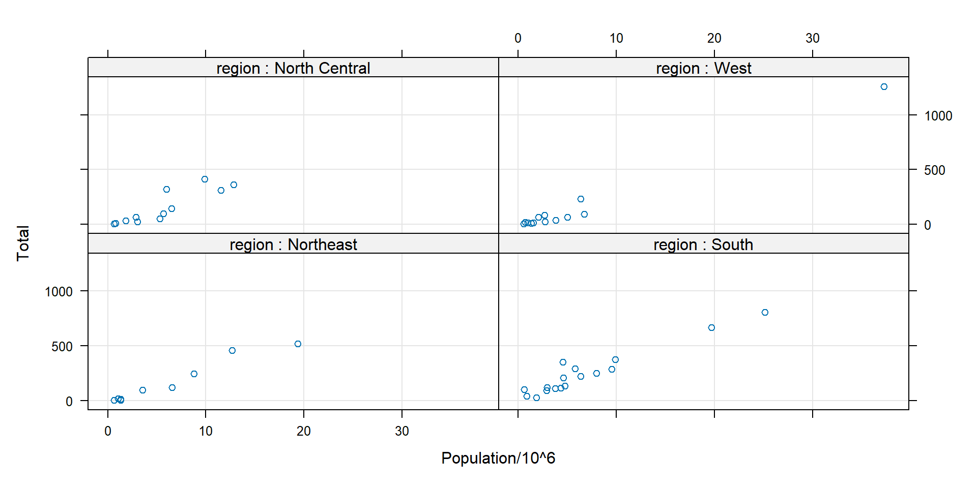
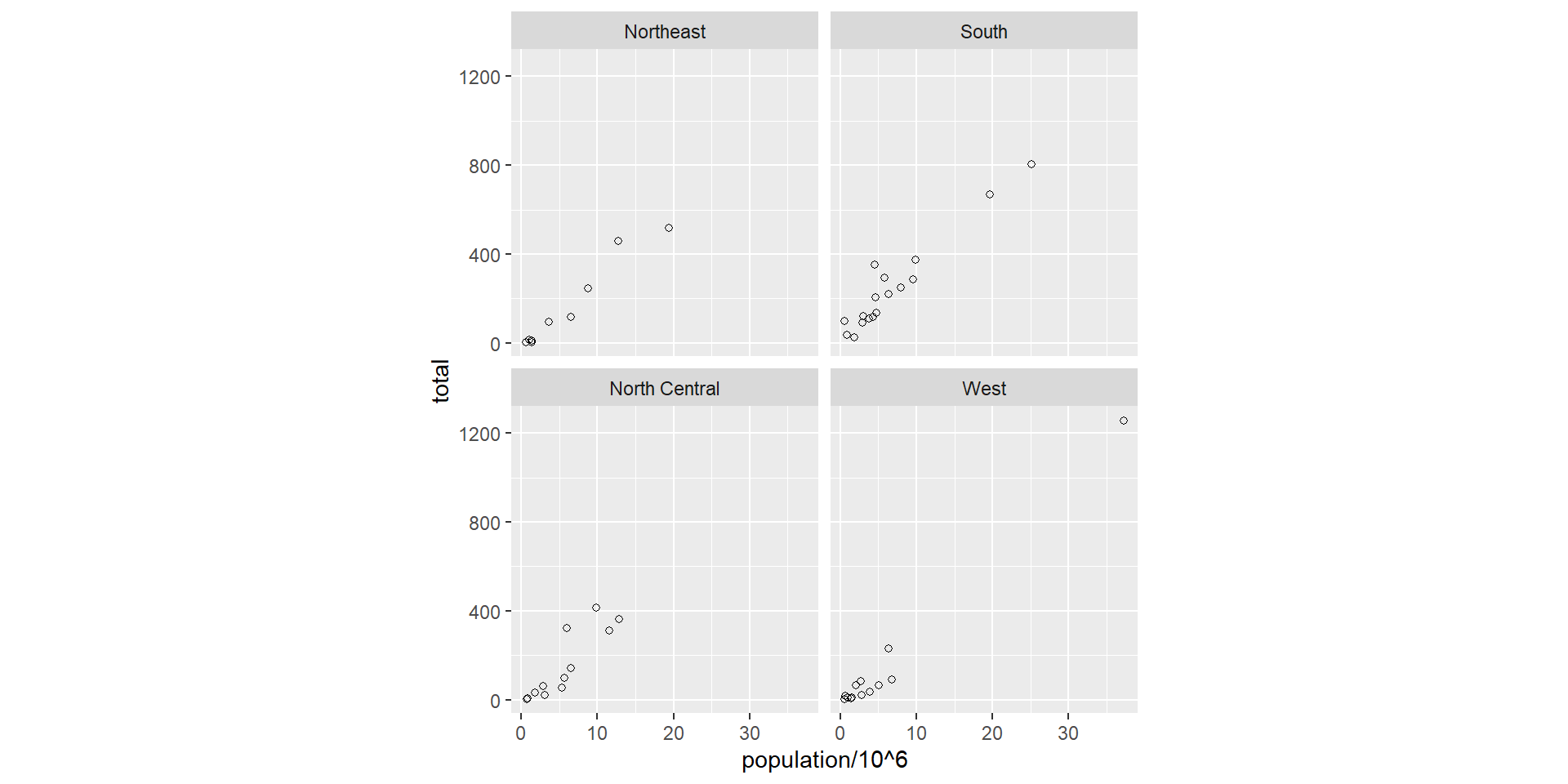
Multipanel plots - lattice
pl <-xyplot(total ~ population/10^6| region, data = murders, #group by regiontype =c("p", "g"), xlab ="Population/10^6", ylab ="Total", # points +gridstrip =strip.custom(strip.names =TRUE, var.name ="region"), layout=c(2,2))# strip: title bar in each panel. strip.names=TRUE: show the var.name "region"print(pl)
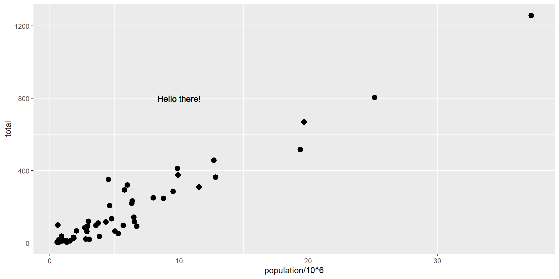
We can override the global aes by defining one in the geometry functions:
p +geom_point(size =3) +# global mappinggeom_text(aes(x =10, y =800, label ="Hello there!")) #local mapping
Scales
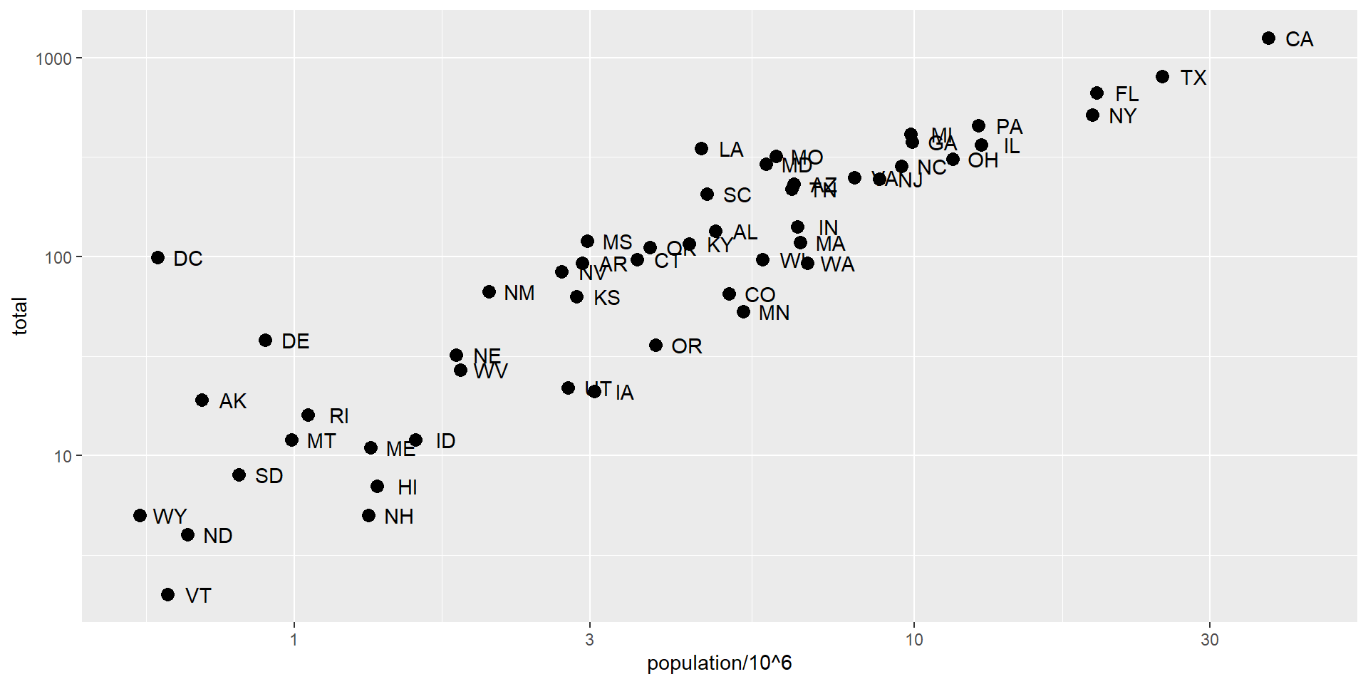
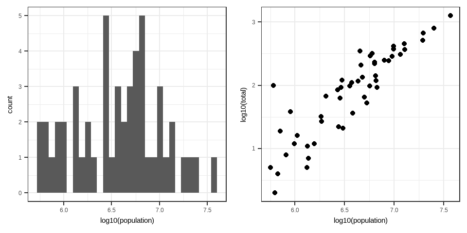
Layers can define transformations:
p +geom_point(size =3) +geom_text(nudge_x =0.05) +scale_x_continuous(trans ="log10") +scale_y_continuous(trans ="log10")
Scales
This particular transformation is so common that ggplot2 provides the specialized functions:
p +geom_point(size =3) +geom_text(nudge_x =0.05) +scale_x_log10() +scale_y_log10()
Labels and titles
p +geom_point(size =3) +geom_text(nudge_x =0.05) +scale_x_log10() +scale_y_log10() +xlab("Populations in millions (log scale)") +ylab("Total number of murders (log scale)") +ggtitle("US Gun Murders in 2010")
Labels and titles with labs
p +geom_point(size =3) +geom_text(nudge_x =0.05) +scale_x_log10() +scale_y_log10() +labs(x ="Populations in millions (log scale)", y ="Total number of murders (log scale)", title ="US Gun Murders in 2010")
This produces the same graph as in the previous slide.
p +geom_point(size =3) +geom_text(nudge_x =0.05) +scale_x_log10() +scale_y_log10() +labs(x ="Populations in millions (log scale)", y ="Total number of murders (log scale)", title ="US Gun Murders in 2010")
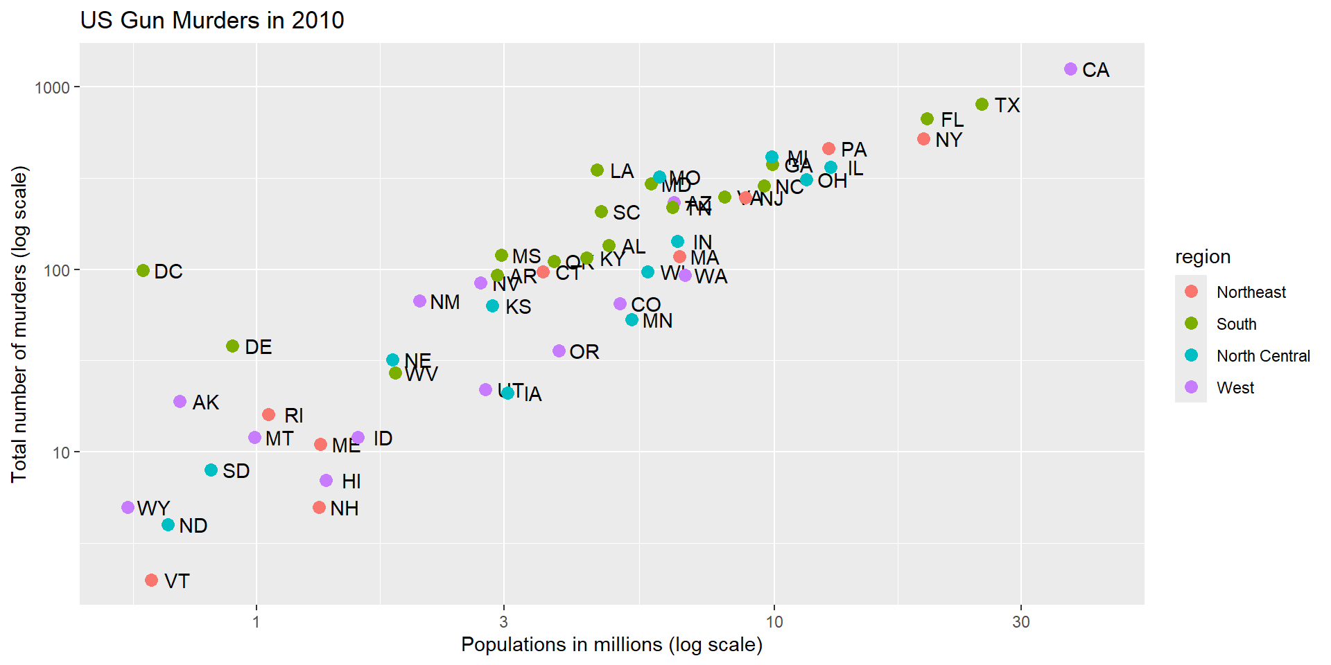
Adding color
murders |>ggplot(aes(population/10^6, total, label = abb)) +geom_text(nudge_x =0.05) +scale_x_log10() +scale_y_log10() +labs(x ="Populations in millions (log scale)", y ="Total number of murders (log scale)", title ="US Gun Murders in 2010") +geom_point(size =3, color ="blue")
A mapped color
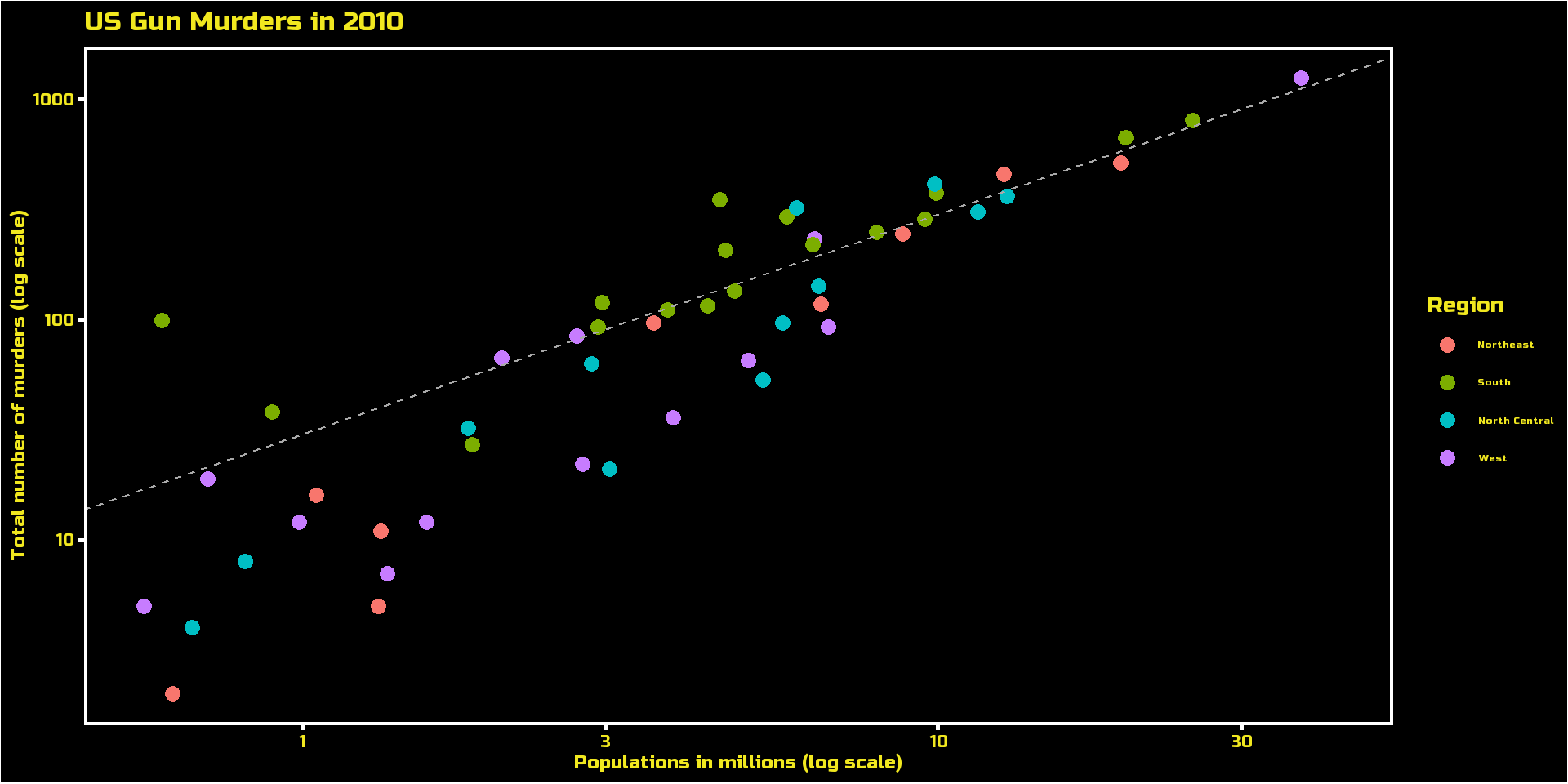
murders |>ggplot(aes(population/10^6, total, label = abb)) +geom_text(nudge_x =0.05) +scale_x_log10() +scale_y_log10() +labs(x ="Populations in millions (log scale)", y ="Total number of murders (log scale)", title ="US Gun Murders in 2010") +geom_point(aes(col = region), size =3)
A legend is added automatically!
Change legend name
murders |>ggplot(aes(population/10^6, total, label = abb)) +geom_text(nudge_x =0.05) +scale_x_log10() +scale_y_log10() +labs(x ="Populations in millions (log scale)", y ="Total number of murders (log scale)", title ="US Gun Murders in 2010",color ="Region") +# Lgend name comes from inside labs()geom_point(aes(col = region), size =3)
Other adjustments
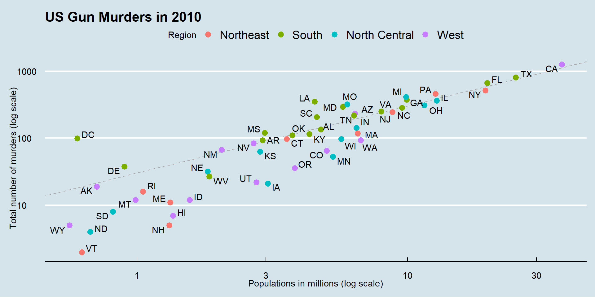
add a line with intercept the US rate.
r <- murders |>summarize(rate =sum(total) /sum(population) *10^6) |>pull(rate)
Add a line
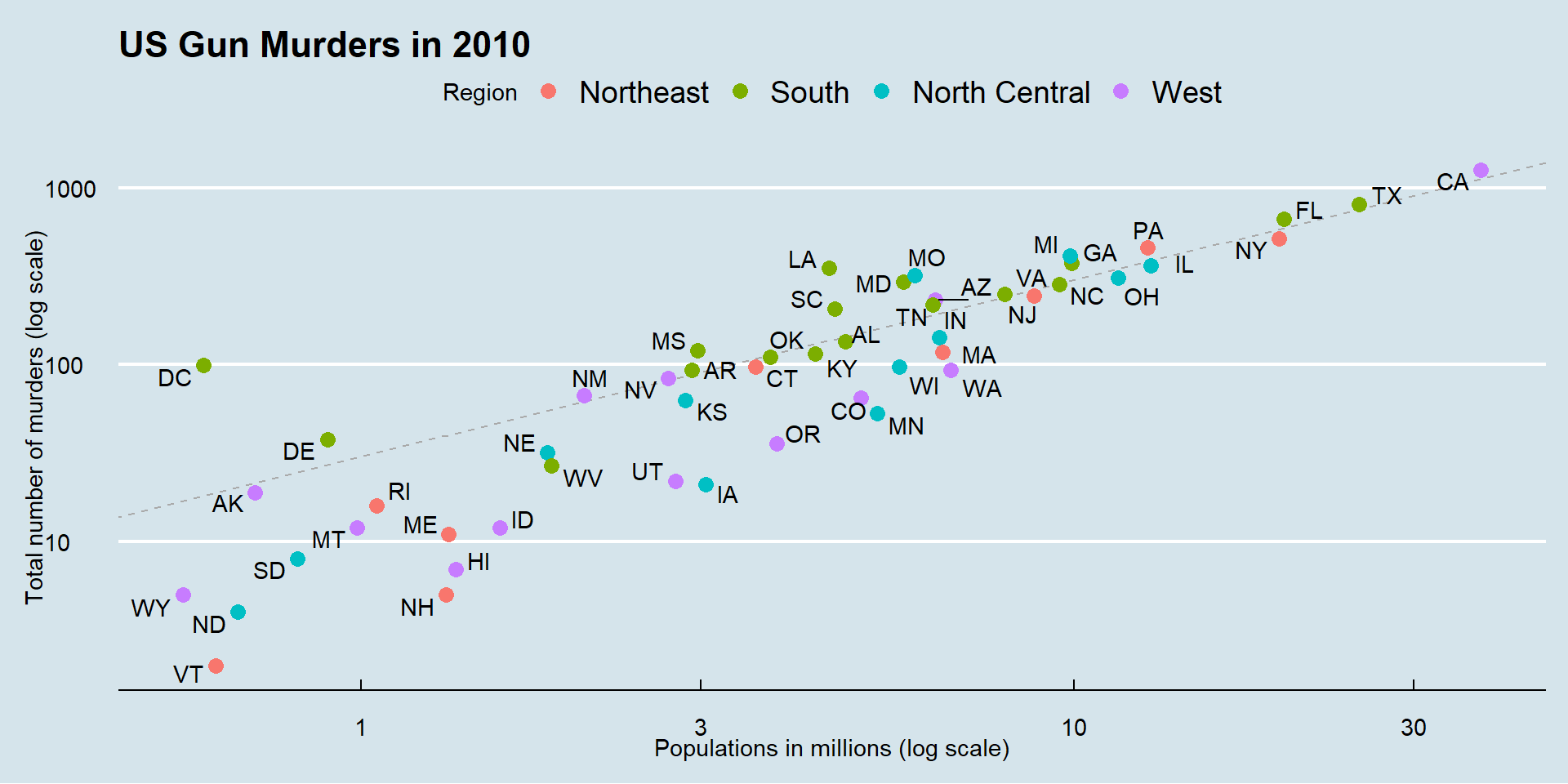
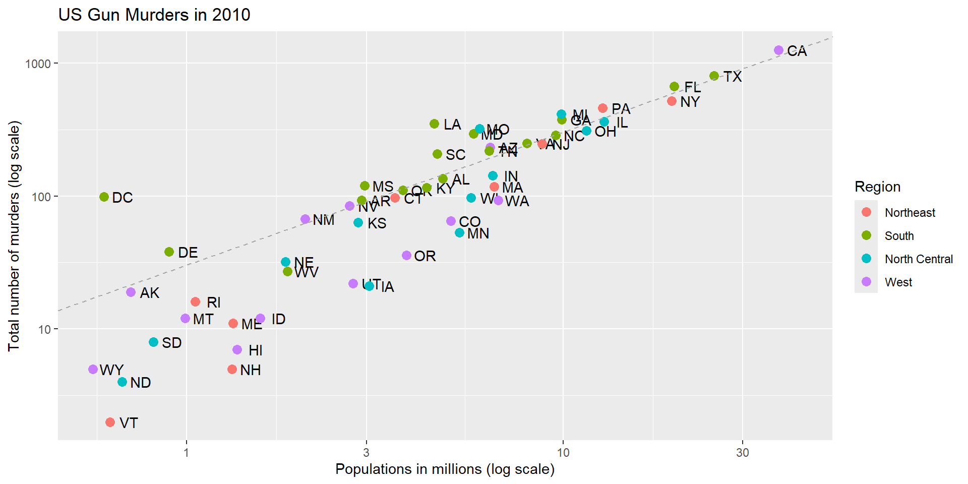
murders |>ggplot(aes(population/10^6, total, label = abb)) +geom_text(nudge_x =0.05) +scale_x_log10() +scale_y_log10() +labs(x ="Populations in millions (log scale)", y ="Total number of murders (log scale)", title ="US Gun Murders in 2010",color ="Region") +geom_point(aes(col = region), size =3) +geom_abline(intercept =log10(r), lty =2, color ="darkgrey")
#default slope=1; lty=2: dashed line
0= no line, 1=solid, 2=dashed, 3=dotted, 4=dotdash, 5=longdash, 6=twodash
We are close!
Assign the graph to a variable
p <- murders |>ggplot(aes(population/10^6, total, label = abb)) +geom_text(nudge_x =0.05) +scale_x_log10() +scale_y_log10() +labs(x ="Populations in millions (log scale)", y ="Total number of murders (log scale)", title ="US Gun Murders in 2010",color ="Region") +geom_point(aes(col = region), size =3) +geom_abline(intercept =log10(r), lty =2, color ="darkgrey")
Add-on packages
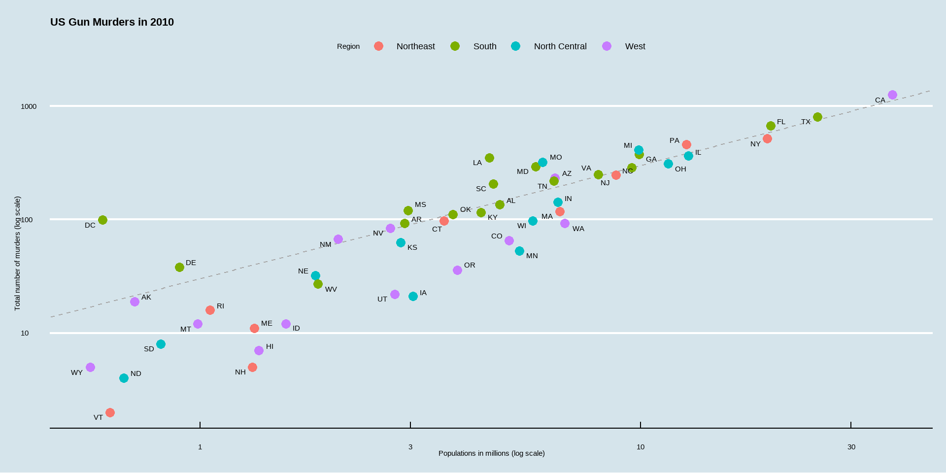
The dslabs package can define the look used in the textbook:
ds_theme_set()
Many other themes are added by the package ggthemes.
Add-on packages
ggthemes provides pre-designed themes.
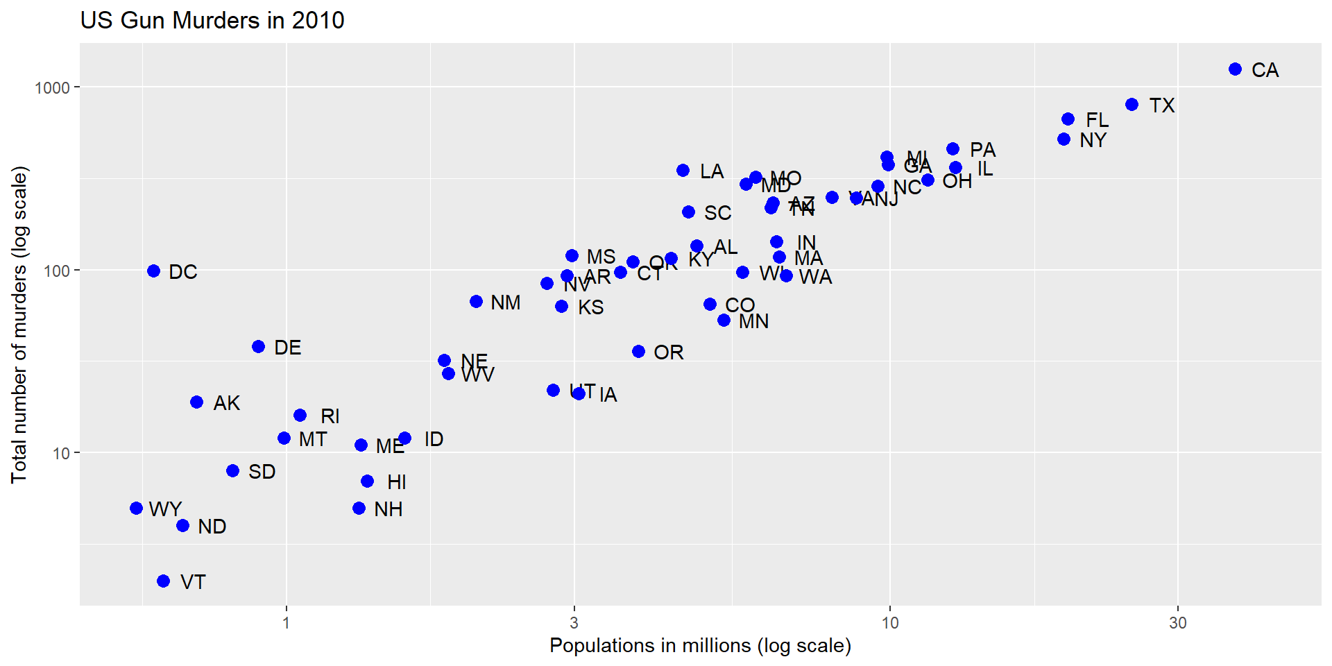
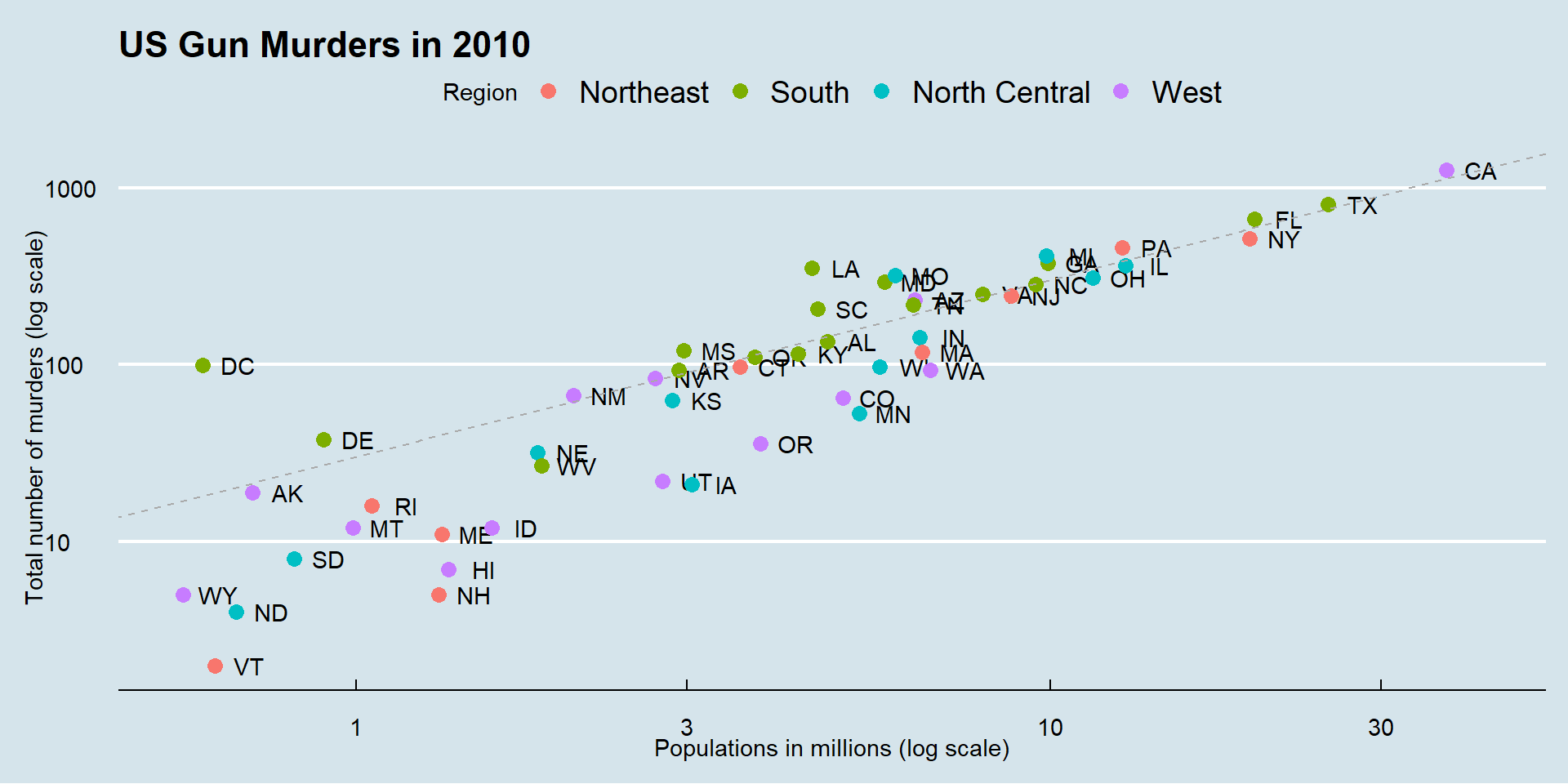
library(ggthemes)p +theme_economist()
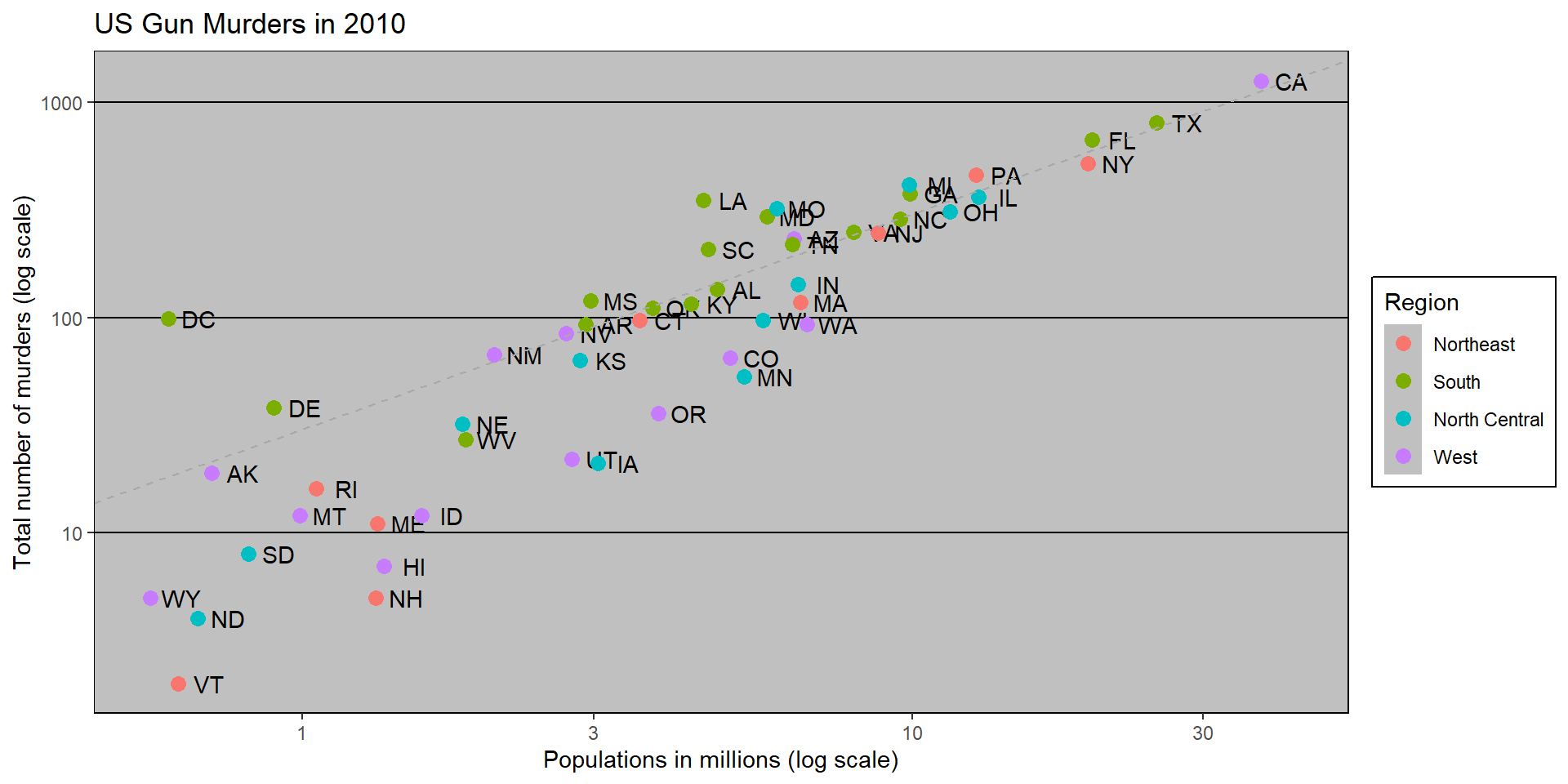
theme_Fivethirtyeight()
Here is the FiveThirtyEight theme:
p +theme_fivethirtyeight()
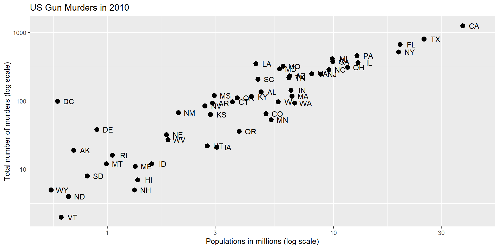
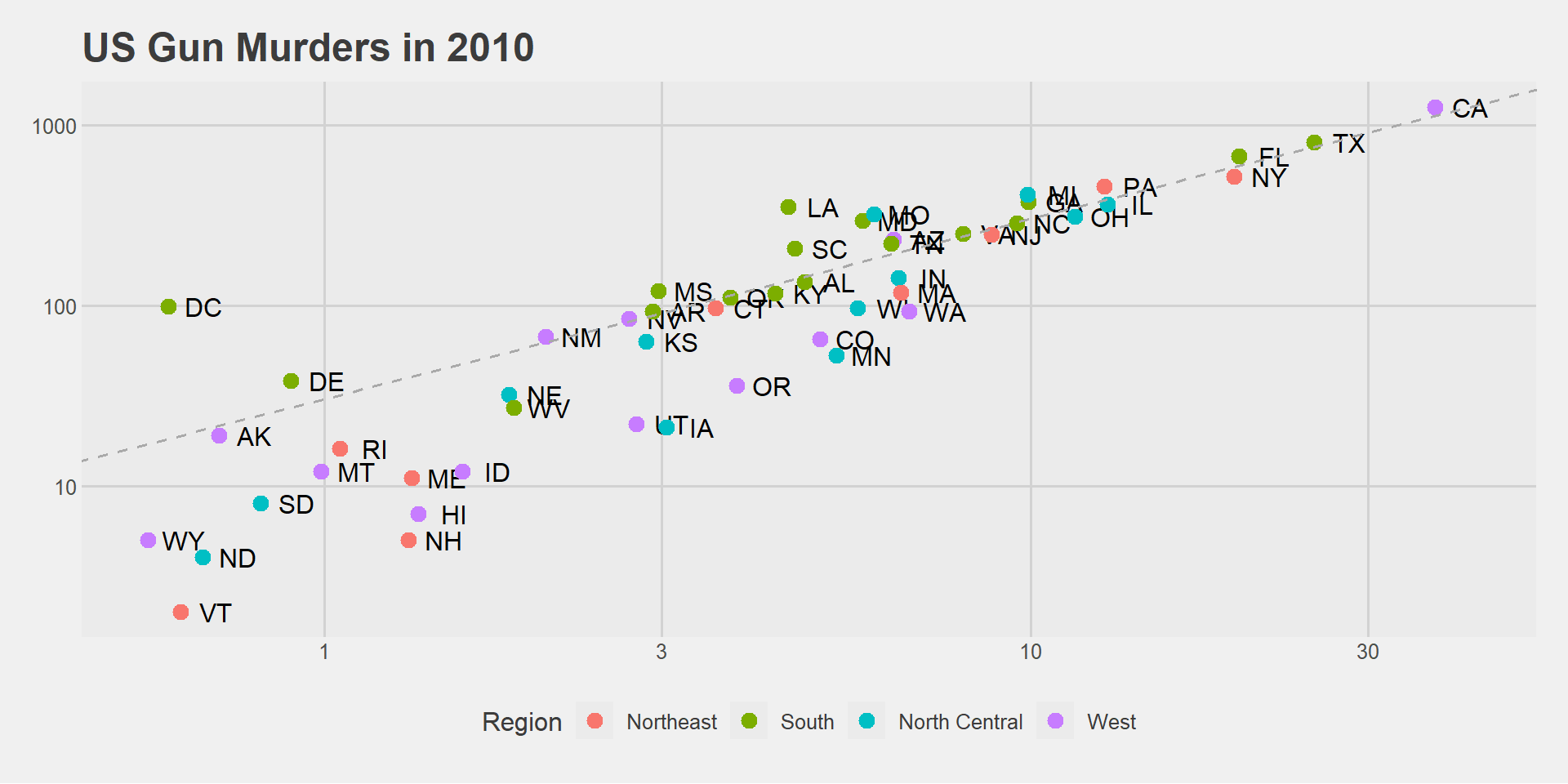
theme_excel()
maybe not a good one!
p +theme_excel()
theme_starwars()
ThemePark provides fun themes:
library(ThemePark)p +theme_starwars()
theme_barbie()
This is a fan favorite:
p +theme_barbie()
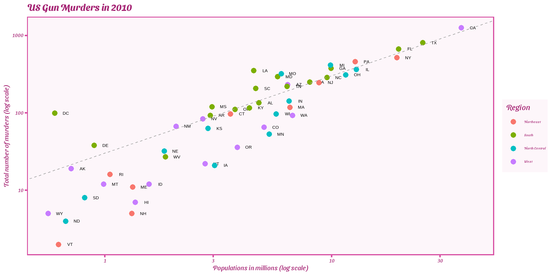
geom_text_repel()
To avoid the state abbreviations being on top of each other we can use the ggrepel package.
We change the layer geom_text(nudge_x = 0.05) to geom_text_repel()